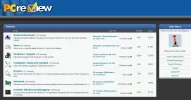
New PCR Design / Forum Software Upgrade

Ian,

The new template is very easy on the eye, just enough contrast and the blue is to die for!
 
Quadophile said:
Ian,

The new template is very easy on the eye, just enough contrast and the blue is to die for!

I am pleased you said that, because I picked the blue colour! :D
 
Thanks for the feedback guys, I'll work a little more on the design and get a test page up and running in the next week or so :).
 
Sexy Bex said:
I am pleased you said that, because I picked the blue colour! :D

I knew there was something about that blue and I could not quite put the finger on just what it was. :D
 
nice, room for improvement ... ;)


one thing I hate since I got a TFT/LCD monitor is ... white paper ... is very bright to me, hope that can be greyed out a bit. :D


:wave:
 
muckshifter said:
white paper..... is very bright to me, hope that can be greyed out a bit. :D


:wave:

You mean gloomy?
laughingsmiley.gif
 
muckshifter said:
nice, room for improvement ... ;)


one thing I hate since I got a TFT/LCD monitor is ... white paper ... is very bright to me, hope that can be greyed out a bit. :D


happywave.gif

I may make 2 skins, one light and one dark :)

I did a quick mockup of a darker skin and came up with this:

attachment.php
 

Attachments

  • Idea Dark.webp
    Idea Dark.webp
    70.7 KB · Views: 247
Oh yes a dark skin would be great, i didn't think it would be too popular so i didn't say anything. :)
 
Interesting :)... does anyone like the 1st better, or is a dark skin more popular?

I don't think it will be too difficult to make a dark and light skin that are almost the same, so I'll make whichever seems more popular the default. :)

In terms of layout, what sort of things would you like to see on the side / top menus? Also, are there any features that you'd like to see (or indeed be removed)? I'm not sure if it will be possible to move the gallery over (but I will try), but I'm sure it will be possible to get a better functioning gallery anyway. I'll consider the Shoutbox for registered users and any other suggestions :).
 
Well, tbh, I like the lighter one.

Always feel that brighter/ lighter colours are better on the eye and the brain. :)
 
yeas, I like the darker one, but it does make the light grey white ?

perhaps can lighten the dark so the light goes darker ... :D


grate works of art are made :bow:
 
The second one is quite striking - but at the same time, easy on the eyes. :thumb: Will give that one my vote too. :D

As Quad said, those deep blues are gorgeous :nod: excellent taste Sexy Bex
:D
 
I am for dark skin but let the blue stay it sure is "gorgeous" as Taffycat expressed!
 
Ian,

Take a look at the Ubuntu Forum and see what you like there, I think it has a lot of things that you can consider incorporating if you like it. The thing that I don't like is of course the color scheme, as far as colour scheme is concerned, we are already on the right track and no need to look elsewhere for ideas, besides, most of us agree on the same things.

Here are two examples of layout for you to check.

http://www.fredmiranda.com/forum/

The following forum has a neat looking Icon legend so scroll down and it is on the left at the bottom.

http://forums.watchuseek.com/f71/

Rather than telling you what to add or not I decided to point you to some forums which I thought were better than most out there which I have come across. If I come across something very interesting in the next day or two I will post it here.
 
muckshifter said:
yeas, I like the darker one, but it does make the light grey white ?

perhaps can lighten the dark so the light goes darker ... :D


grate works of art are made :bow:


Spec Savers :D:D:D
 
Back
Top